Analytiks
Work
Contract
Category
Brand Identity
Role
Designer
A small business grows up.
From Silly to Serious
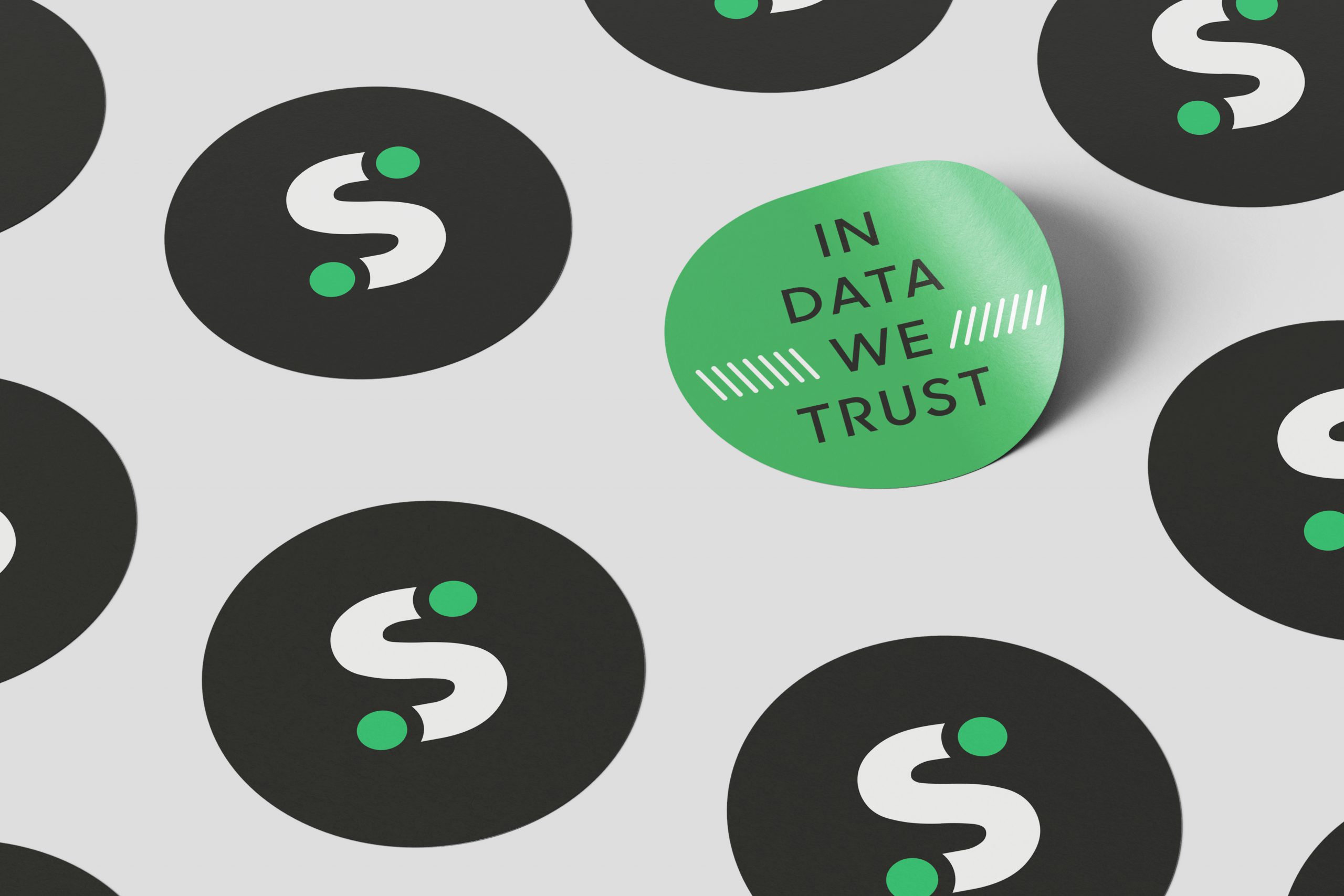
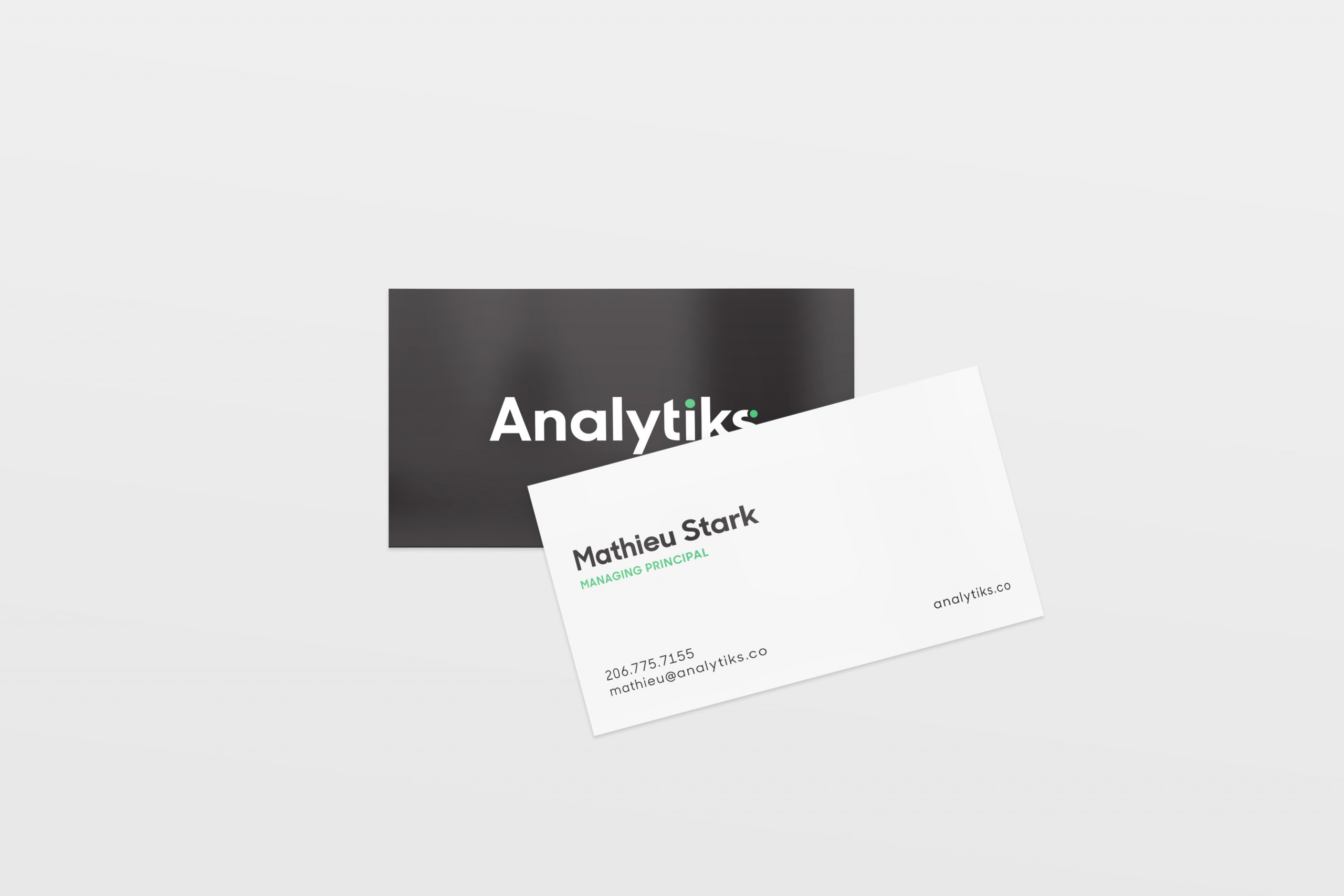
Analytiks was still attracted to the underlying concept of the original logo and the direction of a wordmark—the idea of “connecting dots” was still a metaphor the company uses to describe its services.
To push Analytiks in a more serious direction, we selected a typeface with more traditional letter forms that are still relatively geometric to better allow modification with dots placed at the end of the word mark. A more serious but vibrant color palette was also selected.